Bisera City Set Design
Bisera city set design
The world of my comic is in the imaginary future in some fantasy distant planet, visually inspired by anime or movies I like.
There's gonna be two major set design in my comic, one is the city where the humans live and the other one is the outdoor where the journey of a thousand mile will take place.
As of right now, I only got a faint clue on what I'm going to draw this supposedly epic 'bizarre alien planet' described in my own synopsis, so I'm just gonna rambling about the city setting for now. Baby steps, Mo, baby steps!!! ARRGHH!!! This is much more work than I ever anticipated!!! FUCKKK!!! lol
Since these take place in the future where humans already colonized planet, I originally wanted the city to be super duper futuristic like star wars shit where the building aint lookin' like the building we have today.
Unfortunately, due to time constraints, since I'm on me own single handedly writing, drawing, painting and all that fun stuff, creating all these images from scratch just not happenin', le sigh!
base CGI done by my S.O. which could be built into futuristic city, but it just took too much work to do it this way. Forget about it!
So I resorted to photobashing, whatever the hell can get it done faster to create these fancy ass images without me pulling all my hair out.
The thing with photobash is, unless you do a crapton more work to it, it will have a reminiscent of the source photos, which was taken in our 21st century.
Oh well, I guess I'm not gunna get the fancy star wars shit, but I'm just gonna make do with this for now.
Ghost in the Shell/ Psycho-pass inspired set, with tribute to Blade Runner
The first city backdrop that shows up on the first chapter is where the MC's main goal/drive is revealed. I'm always fascinated with those Ghost in the Shell type background, so that totally inspired this shot.
One of my other biggest influence is the environment in the first episode of Psycho Pass, which I'm sure was inspired by Ghost in the Shell as well.
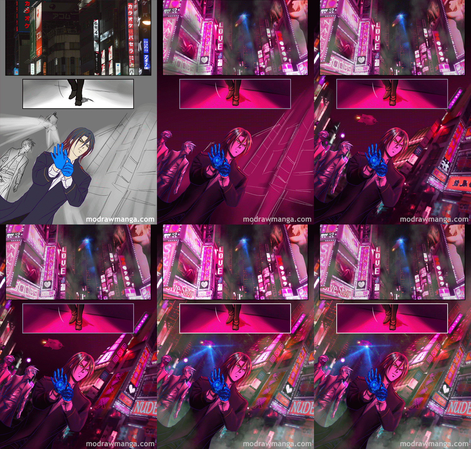
1. BW sketch to set up light/values. 2. Mock up with rough placeholder to decide the color feel. 3. Unfiltered photobashed version.
Speaking of Psycho Pass, I love their first season to death. That brilliant anime is the kind of thing that I wish I would come up with, but I don't have enough brainpower left to pull off awesome sci-fi like that at this stage.
My mental bandwith is fully allocated on the art and character developments for this comic. So it' just going to be a classic a hero journey for this time around.
I resorted to some made up fantasy with a sci-fi backdrop for now. Maybe after I finish Mission Diversion, I'll come up with something more sci-fi and unique like Psycho-Pass one day.
Hunters Headquarters is misspelled here, but hey I'm too damn tired to give a shit at this point...
For the Hunter's HQ building, immediately I think of Jin Mao tower.
I've never been to Shanghai, but I've seen this building from pictures and I like the strong presence that it has, like RAWWRRR!!! I'm a super solid building with dictatorial presence emiting from it!!! GRAWL!!!
It just fit for the image I want to convey on this crazy corporation who rules in my story.
Started with sketch, then setup mock up photo from google image to get a feel, then photobashed around 10+ photos of Shanghai into one distorted perspective image as the base, before moving on to color corrections and adding details.
But I can't just slap my fictional corporate logo on it and call it a day, cos that would be super lame, so I erased the top of Jin Mao tower and fill it in with my own glowy logo made in photoshop.
Photobashed Hong Kong is used as the base of the Red Light District
For the Red Light District sequence, I just added a bunch of lights to make it more future-ey, cos to be honest... I ain't got a clue what else to do to make it more futuristic, so... quick toss in some lights!!!! Bunch of lights!!!! Lens flares!!!! DONE!! lol
Subtle boner jokes here :-)
I also added images on the buildings, like those you see in Las Vegas stuffs, just to highlight the very commercialized aspect of the city where these humans live.
Mildly Vegas inspired, mixed with a bit of Tokyo love hotels
None of these would've been plausible to get done without the royalty free stock photos I bought. It still take quite a bit of work to put it together in photoshop, but way much easier than handpaintin' all this from scratch.
It' a bit smokey due to the radiation yo
I used pixelsquid photoshop plugin for the shuttle crafts and any other objects I have to put into this comic. Drawing props sucks ass the most, it's not fun and it sucked my energy dry.
Japanese mangaka have assistants to do all the BG and props for them, so they can focus on all the fun stuff, which is characters. Unfortunately, webcomic artist has to do all these shit on our own, so pixelsquid has become my virtual assistants to get these shit done.
Started with a sketch, then photo placeholder is to give a decent idea what I want to put in there. Once the basic is established, just keep detailing from there.


